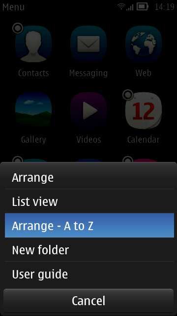
 It's somewhat ironic that, having had hierarchical folder for so many years and with iOS and Android just starting to copy the concept, Symbian has now abandoned folders. Well, not quite. The idea of a flat list was to help new users find apps they are looking for. And, to be honest, even as experienced Symbian die-hards, I bet we've all scratched our heads once in a while looking for 'Recorder' or 'Connection manager'.
The first thing to note is how easy it is to toggle between 'Arrange - A to Z' and 'Arrange - as it was'. Tap the 'More' icon (three stacked lines) and you'll see it on the menu. This alone makes it easy to find an application.
Homescreens
This is going to sound radical, but the very first thing you should do is remove almost all the widgets and shortcuts put on the homescreens by default. In fact, delete most of the homescreens provided. Far better to build up homescreens with bits that you find you need rather than fill the homescreens just 'because you can'. You'll see slightly faster device operation, slightly less data use and slightly better battery life if you keep homescreens and widgets down, especially if they're connected widgets that go online.
Multitasking
Not to be overlooked is the built-in Symbian multitasking - present since the beginnings of the OS, of course, but very visual since Symbian^3, with live 'previews' of what each running application is up to. When you need another app and you know it's running, it's often faster to press and hold the main 'home'/Menu key and simply pick from the carousel of running applications.
0 comments:
Post a Comment